Pink

Pink fine art photography

Browse our wall art with pink colour tones.

Filters

5 products

Harbour Dawn - Fne art photography of Sydney Harbour Bridge by Rochelle Salava | Salava Fine Art.
Harbour Dawn Sale priceFrom $2,000.00
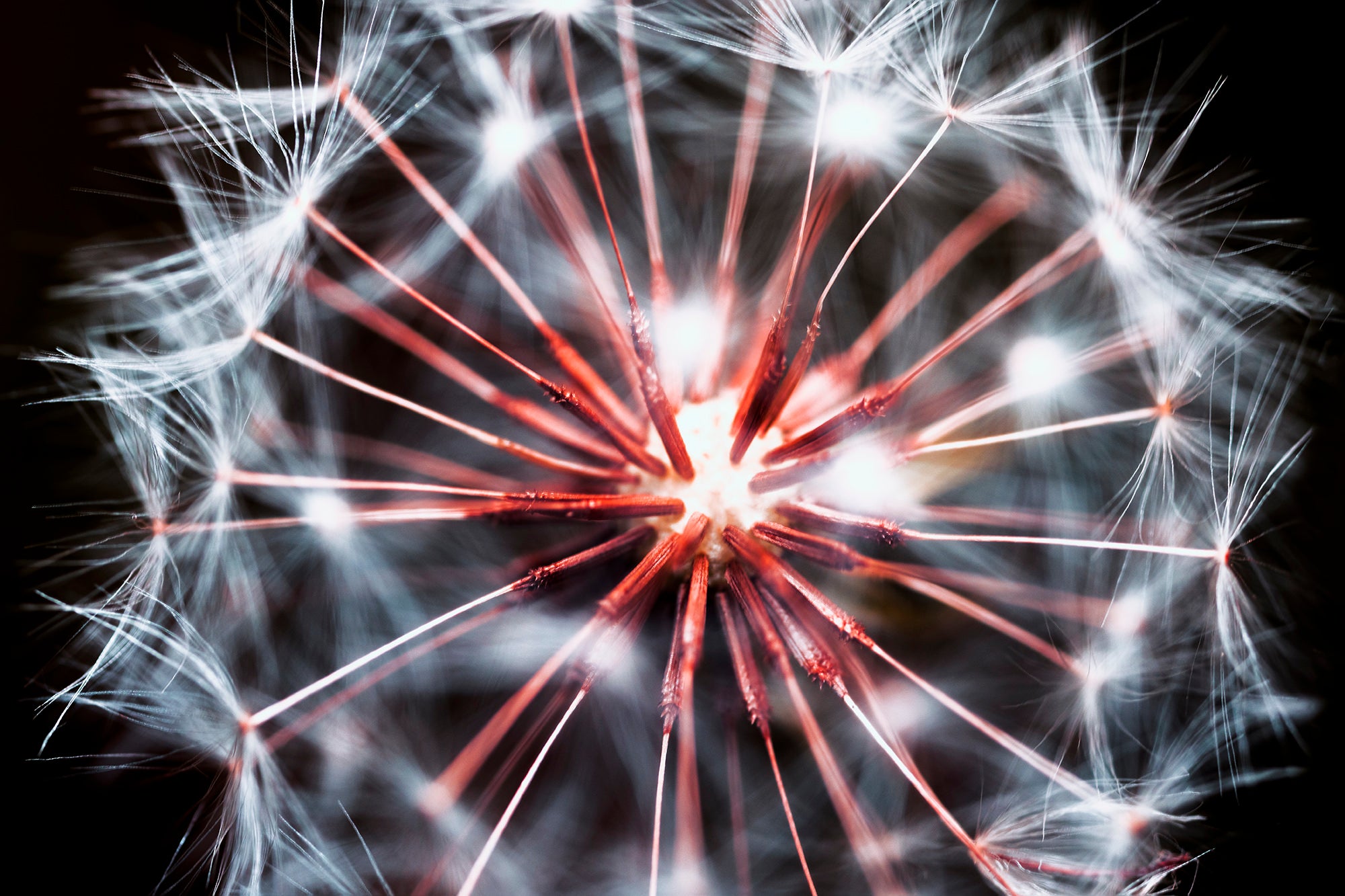
Fairy Wheel Dew - Macro fine art print  by Jan Salava | Salava Fine Art.
Fairy Wheel Sale priceFrom $2,500.00
Morning Opera -Fine art photograph of Sydney Opera House by Rochelle Salava | Salava Fine Art.
Morning Opera Sale priceFrom $2,500.00
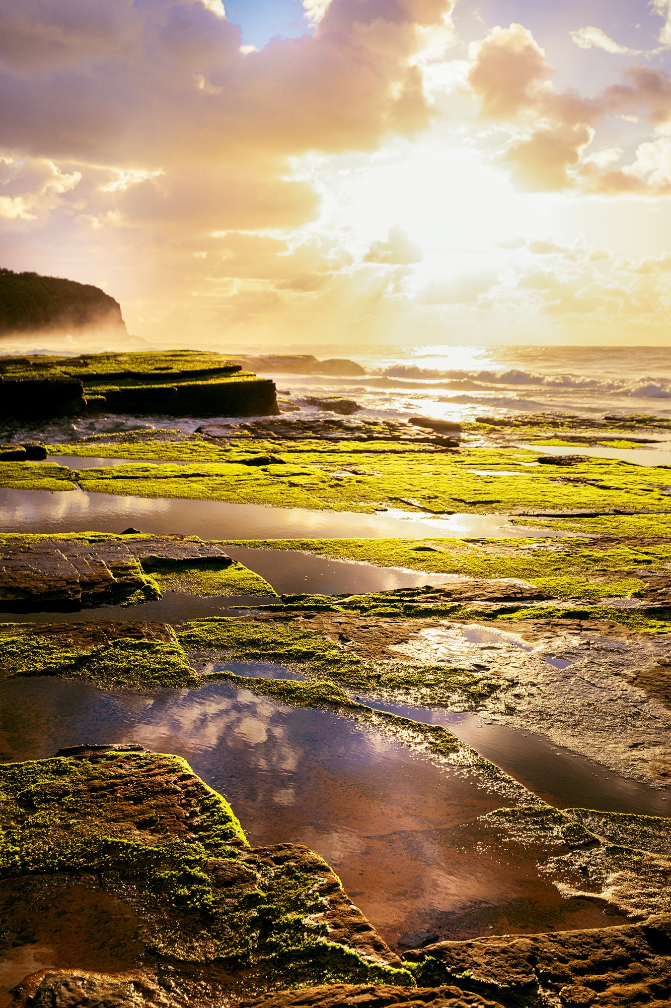
Turimetta Beach - Fine art photograph of Turimetta Beach by Rochelle Salava | Salava Fine Art.
Turimetta Beach Sale priceFrom $2,500.00
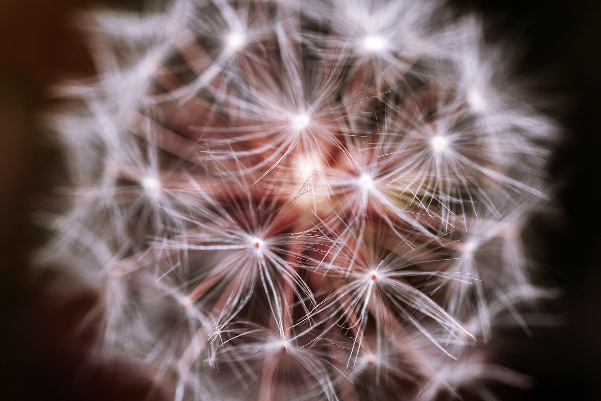
Blow It -  Fine art photograph of dandelion  by Jan Salava | Salava Fine Art.
Blow It Sale priceFrom $2,500.00

Pink colour

Pink is a soft and playful colour often used to create lively art pieces. It can evoke feelings of joy, innocence, and creativity.

What is a complementary colour to pink?

Green is a complementary colour to pink.

The green colour sits directly across from pink on the colour wheel. This creates a visually appealing contrast and makes each colour appear more intense.

What are complementary colours?

Complementary colours are a combination that provides a high contrast and high impact colour combination – together, these colours will appear brighter and more prominent.

What is the colour wheel?

The colour wheel is a diagram used in the visual arts to represent the colours of the visible spectrum and their relationships to one another.

What is a good contrasting colour combination with pink?

Pink & black colours are high in contrast. This combination makes pink appear more vibrant and defined.

What is a neutral colour combination with pink?

White is a neutral colour that complements pink without competing with it, creating a harmonious balance.

What emotions do people connect with pink?

  • softness
  • gentleness
  • playfulness

How to combine colours

Colour harmony refers to the visually appealing combination of colours that creates a sense of balance.

Key principles of colour harmony

  • Complementary colours: Pairing colours opposite each other on the colour wheel (e.g., blue and orange) creates a striking contrast and visual interest.
  • Analogous colours: Using adjacent colours on the colour wheel (e.g., blue, green, and yellow) creates a smooth, cohesive transition.
  • Triadic colours: Combining three colours equally spaced from each other on the colour wheel (e.g., blue, yellow, and red) creates a balanced and vibrant palette.
  • Split-complementary colours: Pairing a colour with the two colours on either side of its complementary colour (e.g., blue, yellow-green, and orange-red) adds depth and interest.
  • Monochromatic colours: Using different shades and tints of the same colour creates a cohesive and soothing palette.
  • Warm and cool colours: Balancing warm colours (red, orange, yellow) with cool colours (blue, green, purple) creates visual interest and contrast.
  • Colour saturation and brightness: Varying the intensity and lightness of colours creates visual hierarchy and depth.
  • Context and meaning: Considering the emotions and associations of colours in a specific context (e.g., branding, art, or design) helps create effective colour harmony.

By applying these principles, you can create aesthetically pleasing colour combinations.